Digital Humanities in Religious Studies has not been what I expected, and not in a bad way either. I thought we would be looking at religions or the concepts and theories of religion through technology and how technology can help assist one in such an endeavor. Rather, it was a critical approach to the concept of data and data collection in relationship to academic scholarship as a whole (across the humanities and even beyond). I have never thought, and I am most people have not either, that data and categorization could be individualized to such a great degree; Meaning, throughout the course we have studied the concept of data as a whole and have seen the amount of work that goes in to collecting, categorizing, presenting and explaining data. The interesting aspect of the collecting, categorizing, etc. is that all of it is done by people, usually groups of people. This course has reminded me what it means for something to be “objective”, namely objectivity is a category one places something in order to use it in a certain manner within society. Nothing can be truly set apart from bias or perspective. For instance we read Marisa Elena Duarte & Miranda Belarde-Lewis work called Imagining: Creating Spaces for Indigenous Ontologies where we looked at how categorization from a colonial perspective has misrepresented the Indigenous population to one degree or another. It shows that one must not be overly confident in the resources and ideas the read, even in scholarship. There are structures in place which have been there for so long that many people cannot see it anymore. DH is trying to lift the veil of scholars and those who read them by revealing said structures and working to create a better field of scholarship for academia and the future as a whole.
Author: Donovan Guinois-Golden
I am a senior majoring in Religious Studies and Philosophy. I graduated with my associate degree in Philosophy in 2021. I think the philosophy and symbolism in religion is fascinating.
Lab 10
My research for my final project is over, and now I am deciding how how I want to dissect the data. I have been exploring what Voyant can do with texts, since that is going to be the main website I use for my project. I thought about going through each of Plato’s books in the Republic and see what words are the most used in each section individually to help me see if there is a pattern. I noticed when I looked at all of the books together in Voyant as a long text file, I saw that the word “true” was used very frequently. I thought about going through each book and mapping out which words are used most frequently with “true” and see if I could graph them on one of the cites we used several weeks ago. I am not set on this, but it is a very viable option.
Lab 9
This is an image of the most common words found within all ten books of the Republic. I pulled all of the dialogue in the books and had the program ignore the words said, say, and book. Because this is a long conversation between Socrates and others, the words say and said are used very often but they do not do anything to tell us what the Republic is about. I removed the word book because it was used only in the titles. The goal of this is to use it in my final project to see if the words mot often used can tell one something about Plato’s work. I think the visual shows the words true, good, state, yes, and man are the most common words. This seems to be accurate as to the message of the Republic.
Lab 7
My data collection for the final project is coming along well. I final decided on what to do for the project, how to construct the project in order to achieve the goal. I am really interested in philosophy, so I knew I wanted to make a project with a philosophical theme. I decided I will analyze all of the Socratic dialogues Plato wrote through the software called Voyant in order to pull the most frequently used words within each of the texts. I will then get that data and plug it into Flourish to produce a visual of the top 5 words in each dialogue. This will enable the viewer to reference multiple texts and detect any patterns that might (or might not) be there.
Lab 6
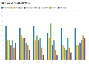
Well, I tried to figure out what I did wrong with the visual that I made from class this past week, but I could not do it. I had to fall back on something last minute since I was not sure where to pull new data from last minute like this. I decided to chart the wins off all the SEC West football teams wins over the past 5 years and divide them up by teams. Of course Alabama is predominantly on top (roll tide), but there was some fluctuation between between LSU, A&M, Auburn, and Ole Miss. Referring to the assignment in class, it is far more complicated than the graph that I have at the bottom since there was so much more data. I did learn a lot using Flourish and how it will relate to Omeka for my final project. My final project will likely be a some sort of bar graph representation, so I am glad to have worked with it when it for this small representation.
Lab 5
The Mukurtu website was quite different than the Omeka website. Mukurku had more options for people who might want to collect data differently, usually from the perspective of another people group. Their website actually has examples of the type of data they enable people to record, such as the Native Health Database, Plateau Peoples’ Web Portal, and Chugachmiut Heritage Archive. When it comes to recording data, Mukurku gives people a wider variety of options to categorize information. For example, the metadata fields that are unique to Mukurku are: original date description, cultural narrative, traditional knowledge, key words, longitude, latitude, location, community records. All of these categories total up to be almost twice as many as the Omeka website. It shows that Mukurka has thought through their categories more than Omeka, allowing for more diverse knowledge to be produced and shared by community groups who might not have had the ability otherwise.
Lab 4
From the several models of data that we reviewed, I really found an interest in text analysis, network visualization, and digital archives. Briefly, I have an interest in text analysis because I think the idea of mapping common phrases/ words would be a really interesting, yet also insightful endeavor. I liked the network visualization because I simply thought it looked really interesting, but then as it was explained to me how it worked, it just made it even more worth while to look into. Finally, the digital archive was my least favorite of the three, but I still found it interesting to archive all of a person’s work, so it is a viable option.
I am really interested in working within the field of philosophy or theology. This is where my entire interest in higher education lies, so I have a decent amount of background knowledge. I am not sure what angle I would like to take; however, I would think it would involve using a person who has a large amount of work, like Thomas Aquinas, or maybe using the Bible itself and archiving/ visualizing it somehow. I also cannot leave the possibility of doing something with data in relation to the Catholic, Orthodox, or Protestant denominations.
I would probably have to do some digging in regards to large pieces of philosophical or theological works. Also, I am not a super creative person when it comes to things like this, so I will have to do some brain storming and perhaps inquire help to narrow down exactly what I want to do. For example, if I landed on doing something within the Bible, then it would probably be analyzing text or creating an archive of stories, words, characters, etc.
Lab 3
So far I have completed two out of the three required data journals. Like I mentioned last post, I decided to do the “My Books” journal which is under the one sitting section and the “My Time Alone” journal which is under the one day section. I enjoyed both of them, but I will first talk about the books journal. I only had to go off my book shelf I have here in Tuscaloosa, compared to the one I have back home. If one was to look at drawing I did, they would notice that I have read every book on my shelf except for one. I also found that I have exactly three genres on my bookshelf, which I expected, but this exercise just confirmed that. As for the time alone journal, that was very interesting. I am definitely an introvert, but I can be gregarious when needed (which is a lot). This exercise has shown me that I spend a lot more time around people, but even more interesting than that, is that it is for longer durations. Over all, I have learned quite a bit about myself, and I look forward to learning more.
Lab 2
The website I visited was rather unique compared to the ones we saw in class since it was primarily concerned with any given visitor making an account and using their software, but we will get into that later. The website itself is called Recogito, and it is monitored by Pelagios who is a digital humanities initiative whose goal is to connect different data about the past together. With this being where Recogito is coming from, it is no surprise that this website is built around “collaborative document annotation”. This means that it is a tool to help scholars, or anyone really, annotate images or texts, then allowing their work to become public data for others to use and look at. It shows one how to annotate images and text through the program and then share their progress and data with anyone they choose. Overall, it is a tool that can be used to produce data that can be shared and worked on with multiple people.
My analysis of the website is quite straight forward since their website the way it is structured is quite straightforward. The entire site is built around the visitor using the software, so it has many nuances that are strategically placed there in order to help facilitate and encourage the people visiting to do just that. For one, the website one has three links and one of them is the login tab. This is created in this manner to give the person a very limited amount of options, unlike many other websites who have many tabs/links. At the bottom of the webpage, there are many comments they chose to rotate through their homepage, as well as statistics that reflect very well on their website. Overall, I think the website is structured very well and is shaped for it’s function, which is to get as many accounts and data from the users as possible. As far as the data itself is concerned, I am not sure there is a real way to know what type it, besides the fact that it is composed of texts and maps. On the other hand though, one can know that the website is not providing data itself, the website designers desire the user to provide the data so the range of topics can vary from person to person.
Lab 1
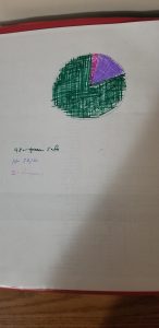
Morgan and I sorted the data we received by the danger of every given stop. 80% we deemed safe, 15% was 50/50, and 5% was actually dangerous. We made a pie chart that showed this. I was pretty confused, at first, as to what I needed to do with the data. This was because I had no idea how to creatively represent the data or what schema to place on it in order to organize/ make sense of it. The exercise I wanted to highlight was the one trying to draw emotion through simple shapes. The idea is to project emotional states back onto a variety of shapes and see how creative one can be. I am not very creative, so it was pretty difficult for me to get the hang of it. Overall, I thought it was interesting, and by the end of this class in December, I hope I can at least a little bit more creative. For my data dairies project that I have to do, one of the projects that I will be doing is the “#6 My Books”. I do not have a very large amount of books, especially not down here in Tuscaloosa, but I really do enjoy reading. I think it would be cool to have all my books mapped out on paper. The second exercise is the “#17 My Inbox” which is the most interesting to me out of the three that will take 1 day. Third is the “#18 Distractions”, which will take 5 days. I would like to do this one just to help with my time management.