Class Summary

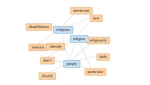
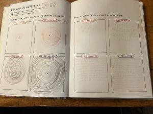
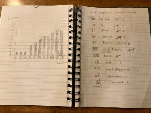
When I first started this course, I truly didn’t know what to expect. I couldn’t really give a solid definition of digital humanities. I understood that this course would likely use digital tools to explore the field of religious studies. The first class text we worked with, Observe, Collect, Draw!, made me question my original thoughts on the digital part of the course. However, after our first few labs and exercises focusing on collecting data in creative and unique ways, I began to understand the importance of understanding data in any research as well as analyzing data in the traditional sense. It also became clear as we explored digital humanities through various projects, encoding, working with visualizations, and content management systems that data could be easily manipulated and was subjective and open to interpretation. Specifically, I learned that while data is important to studying the humanities and in religious studies, it also has its limitations and needs to be approached objectively and with accessibility and sensitivity of different culture groups in mind. Finally, it was only after I began work on my final essay that it all came together for me in connecting all of the digital skills I learned with research in religious studies.

So now digital humanities for me can be defined as the use of technology to theorize, research, report, and share information on different historical, cultural, religious, and social questions. Digital humanities in religious studies can be used to research how data was historically collected, how data is currently used, and challenge any personal bias of researchers when answering questions related to religious studies research. The technology I learned in this course will be extremely helpful in how I interpret not only academic research, but any digital information and visualizations I encounter on a daily basis.

Lab 10

When approaching this project, I chose to research the religious distribution in the United States. I was not only interested in the current religious landscape, but I also wanted to look at the history of how the dominant religions came to be in our country as well as what trends were predicted in the future with respect to religious distribution. I found that there was quite a bit of data on the historical formation of religions in this country. There was also a fair amount of data that was available for the current religious landscape. Many of the resources I found featured data collected through public research institutes and independent analytics/polling companies. I was surprised to learn that a pattern has recently emerged where a larger percentage of the population considers themselves religiously unaffiliated as well as a decline in those who identify as Christian. Surprisingly, numbers for the other two dominant religions, Judaism and Islam have remained relatively consistent in a steady increase over time. I still struggle with the Flourish program; however, I have found using the Voyant-Tools has been much easier. I also have found Scalar to be user friendly. Here is a Voyant visualization I plan to use in my final project.


Lab 9

https://voyant-tools.org/?corpus=d99361159cbe45ca7b0f9df52464b8d1&view=Cirrus

I enjoyed working with the Voyant-Tools program. I found Voyant to be very user-friendly providing several options for visualizations. I chose the Cirrus format for my visualization, which consisted of a display of words that predominantly occurred in the text of one of my reference website articles, “A Brief History of Islam in the United States.” I felt this graphic was unique in its impact as a visualization showing key words that were repeated in the article, displaying them in a fun and colorful format. The Cirrus visualization also differed from the traditional graphs and charts that we typically see when showing data, so this also appealed to me. I guess the one confusing aspect of this visualization would be determining the context of the article since it is a keyword display; however, I also find this interesting because it leads the reader to explore more about the topic.


Lab 7

My Data and Datasheets project started off a little slowly because I had a difficult time narrowing down my topic. I finally decided to research the landscape (distribution) of religions in the United States. I specifically wanted to look at the historical formation and distribution of religions as well as the current distributions and future projections. It has been very interesting combining the numeric data and seeing the many ways you can break it down into visual data. I also am enjoying researching how religions such as Christianity, Judaism, and Islam have come about, and I am including those who classify themselves as non-religious. My only concern is condensing the information to present in the essay. I have also struggled with using the visualization programs from the previous lab. Omeka was challenging initially, but I am working through the fields and making changes as I learn more.

Lab 6

https://app.flourish.studio/visualisation/11491884/edit

I followed the steps for the assignment, but definitely had difficulty with the tabs and headings being transferred properly into Flourish from the data source. I chose an interactive projection map that shows the concentration of the Jewish population of each state. You can also click on each individual state and explore the specific population of that state based upon the data source. This is helpful for my research because I am exploring the Religious Distribution in the United States and the projection map is a great visual for looking at where different religious groups reside. This same map can be utilized for Christians, Muslims, as well as atheists in each state. This was a challenging assignment and really tested my technical skills.


Lab 5

This week’s lab consisted of exploring the Dublin Core metadata fields on the Omeka platform and comparing those to the Mukurtu platform metadata fields. The Mukurtu platform organized the metadata fields into major categories such as Essentials, Core, Rights and Permissions, Additional Metadata, and Relations. Mukurtu matched Dublin’s Core fields; however, there were many more specific fields that included: Communities and Cultural Protocols where each digital heritage item had to belong to at least one community; Item Sharing Settings for the Cultural Protocols; Categories which were high-level descriptive terms for Digital Heritage items; Cultural Narratives and Traditional Knowledge that are community specific; Keywords to make items more discoverable; Traditional Knowledge Labels that are non-legal, social and educational tags for indigenous communities; Licensing Options that specify how a work may be used; Community Records and Book Pages that allow multiple media assets to be presented within a specific Digital Heritage item as well as more specific metadata such as People, Transcription, Geocode Address, Latitude, Longitude, and Location Description. I can clearly see how Mukurtu caters to specific cultural communities with these additional metadata fields.

I believe that the Mukurtu platform assumes it users will have an abundance of very specific and unique cultural, social, and indigenous Digital Heritage items that some users may want to protect from public manipulation but may be shared within a specific community (which would explain the Communities and Cultural Protocols field). On the other hand, Omeka assumes that the Digital Heritage items will be accessed and shared by the public at large, which explains the more general and broad metadata fields.

Lab 4

I am being completely honest when I admit that I was a little overwhelmed by the thought of writing my digital humanities essay. However, after reading the required resource from our class textbook (Drucker Chapter 1, Part B) this week, I felt a little more confident when the steps were outlined very clearly about how to approach a digital humanities project. There were also many different options for analyzing and presenting data in Miriam Posner’s online reference article “How Did They Make That?” Based upon all the references and resources, I think I would be most likely interested in creating a map or analyzing text for my essay. I enjoy working with maps and finding patterns in texts (searching for common words and phrases) seems straightforward.

I am a double major in Geography and Religious Studies, so subjects relating to these fields would be within my comfort zone. For example, I might be interested in mapping visitation patterns in the most popular national parks (Yellowstone, Grand Teton, Glacier, or Yosemite). Should I choose to analyze text for my essay, I would likely focus on the Bible as a reference. For example, maybe research texts related to biblical covenants or the influence of women in the Bible. I have worked with both of these subjects before and think it would be great to research these topics from a digital humanities perspective.

I am familiar with data relating to the national park system and would be able access websites for park visitation easily. I would be interested in seeing if there are any other resources for national park visitation outside of the government databases. I have used a few different Bible reference sites, but I now know, after collecting information in this course, that there is data in many different forms that I have not even thought about that would be helpful for this essay should I choose to go in the text analysis direction. I will be thinking about choosing a specific direction and clearly defining my topic.

Data Journal Progress

The three exercises that I chose to complete for the Data Diaries project are Exercise 2 (Birthdays), Exercise 15 (My Swearing), and Exercise 18 (Distractions). I have collected my data for all three exercises. After a brief review of each exercise, I found the Birthdays Exercise to be the easiest for collecting the data. I was surprised at how many birthdays I remembered and gathering information for those I forgot was simple. I was most surprised by the My Swearing exercise. I swear at lot more than I would have thought while watching college football (or any sporting events). I’m generally not one to swear on a regular basis. The Distractions exercise was challenging because I was distracted by having to record my distractions while completing a task. It will be interesting to see what distracts me the most after I analyze the data from that exercise.


Lab 2

I chose to review the “The Anti-Eviction Mapping Project” (AEMP) digital humanities project. This project’s purpose is to identify and map areas where gentrification has happened and map areas where evictions rates are high. This project also provides a clearinghouse of information and resources for those who are threatened with eviction. The project uses a variety of presentation tools such as maps, software, media, visualizations, reports, murals, magazines, books, and oral histories. The information is gathered and shared through collaboration and processed by the roughly 30 volunteers that work with the AEMP. All of these materials are analyzed and provided to the public to advocate for housing rights.

I found the project description to be detailed and the rationale for the project necessary given the housing crisis in many large cities. This project originated in the San Francisco Bay Area but has since expanded to other cities across California as well as in New York City and Brazil. While the data model may currently be limited to a few select locations, I think the method of collection of data can be applied anywhere. I also like the use of various presentation tools consisting of digital and non-digital materials, which makes it easy for a wide range of users. This project is also a great example of how social experiences/issues can provide the basis for a digital humanities project. The collaborative nature of the project also means that the tools and media used in this project can be applied globally.


Lab 1

I enjoyed many of the exercises in the “Learning to See” chapter of Observe, Collect, Draw! including the emotion through shape exercise and the rhythms of the body. These allowed me to be creative and present data in ways that I would not normally think about. I was surprised to find that the exercise that I struggled with the most was the drawing as measuring exercise. I like structure and routine; however, I found this exercise a little tedious and time consuming. I found that drawing a spiral for three minutes and small circles for five minutes difficult (not to mention that my hand cramped).

If I was to create a schema for the vacation log, I would create a bar graph that represents the number of stops at a specific location. For example, I would utilize symbols for each location including rest stops, gas stops, food stops, restroom/potty stops, etc. I would then log the number of stops in each category by using lines/ticks. To complete the bar graph, the symbols would represent the horizontal values of the graph and the number of stops in each category would represent the vertical values completing a bar of different heights for each category.

The three exercises that I will be completing for the Data Diaries project will be Exercise 2 (Birthdays), 15 (My Swearing), and 18 (Distractions).