This course has taught me a lot. To begin with, I was not even sure what “Digital Humanities” was before I took this course. Now I know that in involves a lot of data, and cool interesting displays of that data. Obviously, we learned DH is much deeper than cool interactive images and numbers. I think the biggest takeaway I got was the level of intricacies in data collection and presentation. We read many good pieces about data. I found the readings about meta data to be most interesting to me. I also found learning about the various websites and tools that are used for different DH projects to be extremely helpful in my understanding of the concepts of digital humanities. I feel like I’ve gained knowledge of many different topics in digital humanities that I can go back and explore on my own time after the course is finished (which I can’t say I’ve had the same experience in many other classes). I already had a some interest in digital topics around computer science and the internet so combining that with the study of religion was very interesting. I really enjoyed all the little weird websites that do non-conventional things like the Ai art creator and writer. I also enjoyed doing the projects for this class because they allowed room for a bit of creativity which was something I was not expecting. Overall, this class has given me new interests and pushed me to think more critically about technology and its relationship with topics in religion.
Author: Cole
Hello! I'm a current senior transfer student at UA. I am from Galveston, Texas. I am a bit of a cinephile (movie buff) and also hopelessly addicted to coffee.
Lab9
I chose to use a bunch of essays from one of my courses in voyant. They are not all the best written, but they are short little reviews of different movies that we watched. The visualization is showing that I need to get better at writing ): I used some words too frequently, and also some of my essays are not very readable according to voyant. I am interpreting the information shown on voyant by clicking through the different tabs to try and find what makes most sense. I think if I had a slightly larger sample size I would be able to better understand the trends shown.
Lab7
I’ve been collecting loads of data for my project. I am gathering information on movies with dialogue that says “Jesus” or “Jesus Christ”. I am entering the films’ title, director, year released, genre, and the full quote that includes those words (also a small video clip from each movie with the quote). I also have the time (ex. 0:50:49) for when the quote appears in the film, but I don’t think that will be that useful. I am hoping to find a correlation in year and genre with the frequency of films that have used those words. There may be zero correlation, but I thought it would be interesting to see if the data has any significance.
Lab6
My data includes a large list of films (still a work in progress) that include dialogue mentioning the name “Jesus”. This can be in any form or sentence like “Jesus Christ, he’s gotta gun!”. I’ve got a list of about 200 films so far that I’ve organized by genre, year released, the exact time that the line of dialog was delivered, with a small video clip (1-3 seconds) for each line from each movie. I am hoping to have over at least 500 entries for my project. I found it challenging to choose a graph type on flourish. There are not too many options that include media, so I had to take my data in a different direction. I do not think the graph that I chose is the best way to display my data. This graph does not have enough space, and a bunch of the circles cover each other making it hard to see all of the films. I had to make my data more focused by distinguishing the quotes between “Jesus” and “Jesus Christ”. I still am unsure of the best platform for my data, but flourish definitely helped me learn what won’t work.
https://public.flourish.studio/visualisation/11478898/
Lab 4
After learning about the various styles of DH projects, I am interested in the visual or audial based ones. I should avoid working with extensive writing or walls of text. I plan to work on a project where visual representation is key. I am drawing inspiration from a website called playphrase. I feel most comfortable dealing with media representation of religion, or any topics combining subjects in religion with news, film, tv, or music. It will take some brainstorming, but there is data out there worth collecting. The biggest challenge will be finding enough data. I will use the internet to collect the data required for a successful DH project.
lab2
I looked at a project called Singing Box 331 which aims to provide an enhanced re-telling of an article about Mohican Hymns that was written in 2019. It is a “glammed-up” news article with pictures and some audio files and large walls of text. It features a non-linear style navigation experience for the user, however, there are not that many directions to go. The materials for this project would be mostly written text, and some images/audio clips as I mentioned above. The processing method of this project is the non-linear assortment of the walls of text and images. There are categories like “introduction”, “music”, and “conclusion” to name a few. The presentation used by the project is a website.
I personally hold the opinion that this project would be much better with more visual and audio representation of the material, rather than huge walls of text. To me, DH projects are unique compared to normal informative websites because of the ability to create an interactive experience for the user, or even display information in an unorthodox way. Especially in today’s world, most people do not have the patience to go through many huge portions of text on a white background. I would think it would be more effective to present the information in shorter snippets, highlighting the important parts of the information. The information would be more memorable and accessible to a wider audience.
Data Lab1
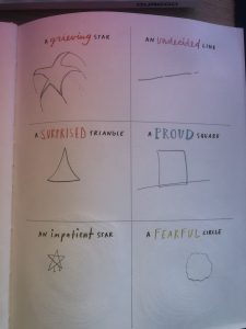
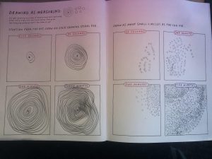
These are the two exercises that stood out to me. The one on the left challenged my creativity, especially the “impatient star”. The exercise in the picture on the right, “Drawing as Measuring”, was challenging for me because I am naturally lazy. Drawing little circles for five minutes straight made me feel like I was going crazy, same with the spirals. I did miss class so I may be off base here. For a schema for a travel log, I would make one including the location traveled to including a picture (if available), how long the stay was, where the person traveled from, and where they went next. I think the best way to show this would be a star type shape, with paths branching out from a central base with the hope that it would avoid too much redundancy. Finally, for my data diaries project, I will be using the following exercises: #3, #6, and #28.
Intro
Hi y’all. My name is Cole Radigan and I am a senior at UA studying creative media with a minor in religious studies. I was interested in taking this course because I have never taken anything like it, and I want to diversify my knowledge in different aspects of digital media. All in all, I’m just here for a good time.