This semester, I have been introduced to and exposed to digital humanities for the first time. Throughout the course, I have come to understand digital humanities as a way to combine a field that is very well known for accuracy, data, and statistics with a field loved for its ambiguity, interpretations, and depth. Within the study of religion, I think digital humanities is a way to put an excess of written word and experience into an aesthetically pleasing visual interpretation. I believe these interpretations allow people who may not be well-versed in the field of humanities to understand the fluidity of data. When I think about digital humanities and religion, I come back to the visualization we looked at in class where you could filter through different religious groups and different media surrounding them. I believe one of them was looking at Seventh-day Adventists and there were sounds, photographs, and texts. The idea that religion with so many contributing factors can be almost summarized into data visualization is very intriguing. There is a lot of insight that you can gain from data–I believe it just requires a little bit more effort with respect to looking at data and humanities. Aside from learning what digital humanities is, something else I found to be interesting during the course was the different ways in which people utilize this data to benefit a certain cause. Specifically, when we were looking at big data and ideas such as this, it was interesting to see the variety of people using digital humanities. One of the most compelling aspects of digital humanities that we learned through this course was looking at the Native American view on DH and how data can be used for both good and bad. I believe that this reading/example conveys the most useful interpretation of digital humanities in relation to religion and culture.
Author: mlbrown28
Lab 9
https://voyant-tools.org/?corpus=7e21d3b4fe9e3d7e09bddbdc41e914bf&visible=125&panels=cirrus,reader,trends,phrases,correlations&view=Cirrus
For this assignment, I compared two texts Irish mythology and The Characteristics of Irish Folklore. I tried to play around with the graphs and charts but I think the cirrus (word trend) was the best visual representation for showing trends between these two. Since the subject I’m looking at is vast and there are multiple interpretations, I find the words commonly associated with both texts to be intriguing and very telling regarding Celtic folklore. I’m interpreting the data by looking at words most commonly used \ to better understand what folklore is to begin with. Words such as tradition, local, dead, custom, gods, power, and stories are very indicative of the culture embedded in mythology.
note: there are a few words in there only because they come from the source such as Jstor, NOV, 2022. I couldn’t figure out how to remove them completely. I tried to go in and select certain words to show up but the visual did not match that so disregard those until I can figure out how to remove them from the visual.
Lab 7
My data project is going well. My topic has pretty much stayed the same, I will be focusing on Celtic folklore, but I have decided to use a collection of media for a few different notable examples of folklore. The data collecting is going well but there are a lot of different interpretations of different stories so it requires a lot of reading and sorting through which one’s I want to include. The only concerns I have with this would be deciding which ones to include and why some data may be more relevant than others.
Lab 6
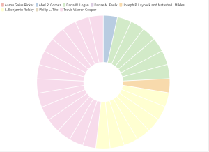
The data visualization below looks at the authors’ respective citations in issues 47.3-4 of the Bulletin. It took a lot of tweaking to correct this data once it was pasted into flourish– due to duplicates. I also had issues with the text being pasted upside down in the spreadsheet so that was super fun. I chose a pie chart for this particular data set because all of the other ones did not show any difference in columns. I assume this was mainly because the issue number was all the same, so the pie chart shows the repetition and amount that each author was present. It easily shows that Cooper holds about half of all citations and other authors like Logan and Rolsky were the next most prominent in this one specific series.
Lab 4
Given what we have discussed in class so far, I am interested in looking at different ways to organize folklore for a particular culture or religious group. Since this is such a broad area of study, I think it would be most fruitful (and least overwhelming) to focus on a specific group to maximize the amount of relevant material sourced. I would like it to be a multimedia analysis that could include visuals, audio, and images …sort of like the DH project we looked at with the sounds and images. Due to my interests and comfortability with topics I will most likely look at Celtic folklore and try and organize it in a way that the plethora of material is more easily accessible. The data required for this project would be pretty much any and everything that I can find. I think that the more included in this project the more beneficial it will be to whoever is using it. Folklore covers a lot of different mediums so anything that is accurate and relative to Celtic folklore I intend to include in the project. My initial thoughts on where to find the data would be the National Folklore Collection or accessible images…as long as they don’t cost $400 to use.
Lab 3
So far I have started working on the one-sitting data diary out of my three. I’m working on “my favorite painter!”. This work was a little bit challenging at first glance. When I saw what the outcome of my drawing was supposed to look like, its seemingly just a bunch of different colors and lines. When I read through the directions, I realized that the dots, lines, sizes, strokes, etc. are indicative elements of the information being described. As a visual learner, I enjoyed seeing the breakdown of what all of these different elements mean separately and how they correlate as a whole. There’s a lot of information that is being put into basically different colored/designed boxes (which is interesting!).
The digital humanities project that I chose to look at was the My Nola, My story project. This project uses a variety of digital materials to help preserve New Orleans’s culture and history. The project is a collection of different video stories of New Orleans natives. The topics in the stories range from art, fashion, education, housing, etc. The material spans a wide range of topics surrounding New Orleans culture in order to make a functioning collection of narratives. The videos also range from 4-18 minutes so it’s very easy to surf around and see a plethora of different videos relating to New Orleans Culture.
I really enjoyed this project. I can see the purpose of it is obviously to preserve the culture and also create a universal/accessible website where people can view different narratives. Being able to hover over the icons and directly pop into a video that you can also easily leave was a feature that I liked about this project. I also think it was beneficial for them to include a variety of different topics such as policies, housing, and the art world. I believe these topics allow different people to see all of the different moving parts of New Orleans culture.
Lab 1
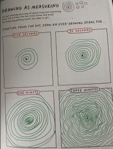
- The spiral exercise was the most challenging exercise for me. The first two parts were more straightforward due to less time but it was interesting to see what could be done with more time and constant attention to the drawing.
2. The schema we created looked at the comparison of time spent doing something safe versus something potentially dangerous. It was split up into three categories; safe, neutral, and dangerous. We then color-coded each event on the timeline with a corresponding color. After this, we broke it up into percentages and then a pie chart to see the visual data.
3. I will be doing #7(my favorite painter), #16 (my time alone), #18 (my distractions)
Introduction
Hello! My name is Morgan and I’m a senior with a double major in Anthropology & Religious studies. I am taking this course to see the intersection between Religion and DH…and because I talk to my computer like this every day…