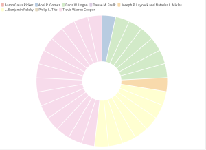
The data visualization below looks at the authors’ respective citations in issues 47.3-4 of the Bulletin. It took a lot of tweaking to correct this data once it was pasted into flourish– due to duplicates. I also had issues with the text being pasted upside down in the spreadsheet so that was super fun. I chose a pie chart for this particular data set because all of the other ones did not show any difference in columns. I assume this was mainly because the issue number was all the same, so the pie chart shows the repetition and amount that each author was present. It easily shows that Cooper holds about half of all citations and other authors like Logan and Rolsky were the next most prominent in this one specific series.
Really good job, I am glad you were able to work through any issues you had when working with the large set of data. I was not as fortunate lol. It is an interesting outcome, though!
I was having a lot of issues with my graph and the data for the lab too. I think the visualization is really cool and it is interesting to see the author’s citations visualized this way.