Final Post

Over the course of the semester, I have come to understand digital humanities as the use of data and technology to analyze and present information in different ways particularly in relation to the humanities. One of the things that interested me during this class was the use of technology to study and accomplish things that may not have otherwise been possible. Thinking about the massive projects that we have learned about this semester for example in relation to texts and history and how technology was used to accomplish these projects that would have taken someone too long to do or could not have been done. Before I took the class, I had seen the three-dimensional modeling done with archaeological projects and I thought they were really cool, but a lot of work goes into making them and so learning how they and the many other projects that we looked at during this class were created showed me that some of these projects likely required technology or technology created new ways for the information and data to be presented, visualized, and analyzed.

Religious studies is such a broad field that studies religion but also looks at so many different things like definitions. It taught me critical analysis skills and it relates to so many different fields of study. Digital humanities can be used to study religion and make massive projects possible and present or analyze that information in different ways. The skills learned in studying DH like making charts, graphs, and looking at things like patterns or metadata are useful and can also be applied to so many other projects, classes, and subjects including religious studies.
Lab 10

The question I am looking at for my project is related to the development and decline of Ostia in the Roman period through the construction, modification, and either destruction or abandonment of buildings in the archaeological record. I am also looking at how building use changed throughout the centuries. In my data, there is a pattern of construction that begins in the 2nd century BCE and grows until the 2nd century CE but sharply declines in the 3rd century CE. During the 2nd through the 4th centuries CE, modifications and buildings being largely repurposed after something new was installed in it, like a hall used for commercial purposes that became a bakery, increased. In the 3rd century CE, several buildings were destroyed or abandoned. There is evidence of a few modifications from the 4th century through the 6th century, but the data is much smaller than in the 2nd and 3rd century. Some of the buildings like the Garden Houses were destroyed in an earthquake during 3rd century but there is evidence that people rebuilt or were still using the building above the destroyed layer in the 4th century.

https://public.flourish.studio/visualisation/11735938/

Dates and the function of the building are always kind of challenging because date ranges can be so large that they sometimes span multiple centuries and for some of the buildings, archaeologists either don’t know what the building was used for or there are multiple debates about what a building was.

Lab 9

https://voyant-tools.org/?corpus=7a10b6daa70e1a05b903a80648e48404&query=religion&query=study&query=religious&query=scholars&query=work&query=theory&query=university&query=mccutcheon&query=just&query=studies&view=Mandala

The texts I was visualizing was the eight texts from Tuesday’s class by Dr. McCutcheon. The visualization is called a Mandala visualization and it looks at the relationship between terms and the texts. The closer the document is to the term, the more frequently the term appears within the text. This visualization could establish how often words are repeated within a document and the frequency could be compared between texts.

Lab 7

I am trying to map the development of Ostia Antica, which was an important port city for Rome, through the Roman Era. My data collection project is going fairly well. I have chosen the locations I want to map, and have at least one photo for every location, the date it was built, what each location was, and how it changed through the centuries. The concern I have with my data relates to the dating of the buildings. Some of the locations I have very precise dates for, either a specific year or a range of two or three years, for others I have the reigns of Roman Emperors, and for others I only have centuries. Sometimes the centuries and the reigns are split into early, middle, late, or halves and quarters of centuries. So, I am going to have to find a program with a time slider showing the different time periods or perhaps multiple bars or I am going to have to find a way to standardize the data.

Lab 6

The graph I made is looking at the author’s affiliations, universities or organizations, and the dates of the publications (2015-2019). First, I copied the publication dates from the author spreadsheet into a google spreadsheet then I did the same with the affiliations. Using the two columns, I made a pivot table where the publication dates were in the row section and affiliations in the columns. Using the value option, I selected the calculated field using the affiliations information. For this project I chose a column chart (stacked) from Flourish because it looks at the number of articles published on a specific date and allows for looking at different things within that information. The graph’s x-axis is the publication dates and the y-axis is the number of authors published on that date subdivided by the number of authors from each university or organization. I initially tried to use the data from 2010-2021 but it was so large Flourish would not display it properly so I reduced it down to the first five years in the document.

I think the information my graph communicates to the viewers is the number of authors who published articles and the affiliations of the authors. It looks like most of the authors are affiliated with colleges or universities, but there are some who are from organizations, like the American Academy of Religion, and independent scholars.

https://public.flourish.studio/visualisation/11476516/

Lab 5

Mukurtu is a project and platform that empowers communities to manage, narrate, connect, label, and share their digital heritage materials, history, knowledge, and stories.

Mukurtu has several metadata fields that are unique to it in comparison with Omeka. The fields I found that were unique were Media Assets, Communities and Protocols, Category, Cultural Narrative, Traditional Knowledge, Traditional Knowledge Labels, Licensing Options, People, Transcription, Location Description, External Links, Collections, Community Records, and Book Pages. There were also a few that were not precisely labeled or described the same but seemed to be similar metadata fields between Omeka and Mukurtu. The field of coverage within Omeka covered the space and time of the items while in Mukurtu, it was separated into original date and original date description, geocode address, latitude, longitude, and location description. One of the fields in Mukurtu, Item sharing settings, seemed similar to the public checkbox when an item is added in Omeka but it had different access settings. Keywords in Mukurtu seemed similar to the tags in Omeka.

Omeka is very generalized and compared to Mukurtu, it does not have very many fields or places to really document details. I think in comparison, Mukurtu is more focused on the item, the cultural details about the item, and the cultures and communities. It has more categories and where Omeka combines metadata like time and space into a single field, Mukurtu separates it into a very specific location and time or has a text boxes for additional description.

Lab 4

There are two different DH projects that we looked at this week that I would be interested in doing, either a 3-D modeling project or a mapping project. The topic of my project would probably be an archaeological site, either related to the classical period or maritime archaeology.

The data I would need for these projects would depend on the type of project I ended up doing, although there is some overlap. In general, for either one of the projects, I would need academic journals and books, photographs, the locations of features in the site, historical texts related to the site, and several maps from different time periods. I could get some of this data through academic journals, other online sources, and the library.

Lab 3

The three exercises I chose to do were #06 My books, #17 my inbox, and #22 What I eat. I have completed the data gathering for all three exercises. What was unexpected as I tracked this data was how many books I have that are not very well organized. I try and organize my bookshelves by author and series or for example, all of my textbooks are on one shelf. This exercise showed me that I have sometimes the entire series all in a row, from first book to last book, but as I was doing it, I realized that for other series I would have book 2 and book 3 were right next to each other but book 1 was on a different bookshelf. One of the other unexpected things I realized was for some digital books that I had not read in a long time, I had to go and check what the completion percentage was because I could not remember if I had finished them or not. 

Lab 2

The DH project I looked at was The Connections in Sound Project by Patrick Egan. The project aimed to create connections within the thirty-seven collections of Irish Traditional Music in the American Folklore Center in the Library of Congress and the role of the internet and archives. Egan also examined the type of music, how it was collected, and how it can be accessed within the collections.

The website for the project only has two pages. The first page contains two quotes from John Miles Foley’s (2012) book Oral traditions and the Internet. Clicking on the link contained within the author’s name opens to the University of Illinois press’ page for the book. The first page also contains a brief introduction to the project. The first chart on the page shows a color-coded list of the types of music contained within nine of the collections. The second visualization creates connections between the type of music, ten collections, how the physical recordings were initially done, and how they can be accessed.  The second page looks at mapping where and when each of the collections came from.

The visualization of the first chart can be filtered for the type of music. The second visualization is a little bit harder to make sense of because all the connections overlap and interweave so it is difficult to figure out what connects where. This problem was solved by making each of the parts movable which makes it easier to see the connections. The introduction to the third visualization on the second page says it uses US census data from 1900 to 1980 and the location of the collections on a map of the United States. I cannot see the map or the census data, so it looks like a bunch of somewhat randomly placed dots that each correspond to part of a larger collection. However, clicking on the dots is cool because it opens a google document that contains their data from the collections for the project. One of the things I was expecting with this project was accessible audio files for the music like the religious sounds project we looked at in class.

Lab 1

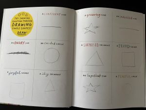
The exercise I had the hardest time with was the drawing emotions with shapes because with some of them I struggled with trying to figure out how to show the emotion within the drawing.

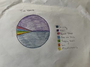
The schema I would create with the travel log would be trying to find out how much time of the trip was spent doing various activities or being at certain places. I would create seven categories, six of which would correspond to the entries of the stops like food and drink, supply stops, gas stations, hotels and Airbnb, time spent parked or at rest stops, and then a miscellaneous category that would include entries that did not fit well into the other categories. The seventh category would be time spent driving.

The three exercises I will do for the data diaries assignment are #06 My books, #17 My inbox, and #22 What I eat.