This class has taught me a tremendous amount of useful information about data. When I initially signed up for the class, I assumed it was a lecture class on different religions around the world. I was unaware of what digital humanities even was so I took a shot in the dark and took this class. Overall, I am glad I took this class because it has taught me valuable knowledge on working with data, which in this day and age is more critical to know now than ever before. I have come to understand digital humanities as the look into how humanities around the world are intersecting with ever changing technology. Technology is critical in any facet of structured education, it used for the most basic of task such as turning in homework, to finding scholarly articles on religious texts. Its easy to tell how religious study can fit into digital humanities. Digital humanities has to do with the discipline of humanities and religion is core part of humanities studies. Through Digital humanities, we are able to extract data from specific texts and see how often a word or phrase is used.
Author: jddecourcey
Lab 10
For my final project I am exploring religious movies and how they are made. Mainly I am looking into who is making the movies, where they are filmed, and who is representing the characters. My question is “Are religious movies accurately portraying people of faith?”. I ask this question because representational ethics is highly debated topic in film and television, this mainly due to concerns of type casting roles instead of choosing actors accurate to the people they are playing. One place I am stuck at is creating a heat map of where the films are shot.
Actors who played Jesus, Moses, Noah, Buddha and more religious figures
Lab 9
https://voyant-tools.org/?corpus=36c2f0135538b4476709d141c5bb528f&view=Cirrus
For this lab, I choose to visualize the screenplay “The Last Temptation of Christ”. This is a film from 1988, written by Paul Schrader. The visualization is showing the which words are the most used in the screenplay. The largest word signifies the most used, while the smallest word is the least used word. “Jesus” was the most used word with 725 uses. From what I could tell, “turns” is the least used and smallest with 31 uses. Since this is a screenplay, and I didn’t filter out any words, words like “cut”, “ext”,”int” are used frequently as sluglines, but don’t contribute to the story itself, but rather as directions for the filmmakers. Jesus makes sense as the most used word, seeing how Jesus is the main character, meaning his name is spoken a lot in dialogue and used as character headings.
Lab 6
I used the visualization we created in class. This allowed me to follow along so that the visualization turns out as well as possible. The data allowed us to see the authors and the amount of citations the author and co authors had. I choose to present the data in a network graph because it is easy to clusters of citations and easily grasp the data on a first glance.
https://app.flourish.studio/visualisation/11444083/edit
Lab 5
Mukurtu seems to be a very useful site, similar to Omeka. Mukurtu does have some unique feature such as:
- media assets
- communities and protocols
- item sharing
- traditional knowledge field
- Cultural narrative field (used for historical context)
- keywords
Mukurtu is a site aiming to empower communities to manage, share, narrate, and exchange their digital heritage in culturally relevant and ethically-minded ways. This is different from Omeka in that Omeka is open to communities such as religious studies. Mukurtu seems to be very good at the specific topics they aim to share about. Omeka might be a better platform if you are considering doing something not related to culture and ethnicity. However, if you are planning on presenting data about what Mukurtu is aimed at, then it will be a better site to use.
Lab 4
For the final project, I am interested in creating a distribution map that shows the major religions throughout the country. I would make a point distribution to see where religion is clustered throughout the country and see obscurities like religion is low population areas. I am interested to see this because it could tell you a lot about culture of a certain area. You could also tell a lot about the types of people that live in certain areas. I would have to research places of worship in large cities through America. For example I would research the amount of Jewish temples in California place a dot at each one. If I do this throughout the country, it could tell an interesting story about religion in the United States.
Lab 2
For lab 2, I choose to take a look at “The Delek Achives”. This project is a research initiative by the Delek Education Foundation that intends to identity and shine light on religion-based discrimination in India’s schools. This project is different from most by the way it uses real first hand accounts of discrimination rather than data from surveys. Most stories from the project are written by people who are directly associated with the education system in India. The posts are usually concerned with deeply traumatic experiences that come from teachers, students, administration, and even parents. The hope of the Delek Archives is to reimagine the act of archiving as an open collaboration. The project aims to demonstrate that discrimination is just as much a personal narrative as it is a systemic pattern.
I like the approach this project takes. It uses a story to shine light on discrimination rather than relying on data to tell how horrible something like discrimination is. I think people respond much stronger to a personal anecdote than to data. To me, this project is successful and more projects dealing with emotional matter should consider a personal narrative approach.
Lab 1
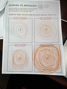
I choose to highlight this exercise because it demonstrates how important time when dealing with data. When time is not important, the spiral is very loose and with a lot of space in between. When time is the most important component, the closeness becomes very precise and crucial.
For the schema, I would look at how much time was spent actively driving vs how much time the car was parked. This would be fairly straight forward as I would go down the list of times and note when the car was a rest stop, getting food, getting gas, etc. I would then total that time and the time spent driving which is indicated by the long stents in between stops. For the data diaries, I will be doing “How many variations to a line”, “Draw your breathe”, and “Color palette testing”.