I’ve been collecting loads of data for my project. I am gathering information on movies with dialogue that says “Jesus” or “Jesus Christ”. I am entering the films’ title, director, year released, genre, and the full quote that includes those words (also a small video clip from each movie with the quote). I also have the time (ex. 0:50:49) for when the quote appears in the film, but I don’t think that will be that useful. I am hoping to find a correlation in year and genre with the frequency of films that have used those words. There may be zero correlation, but I thought it would be interesting to see if the data has any significance.
Lab 7
My project is going well, though finding texts/ other kinds of relevant data is proving to be rather difficult. I am working on mapping various antisemitic publications in Europe before, and during World War 2. I plan to use a heat type map to show the places that published the most during this time period. My biggest concern with my project so far is mostly related to the gathering of data, though I’m sure with time this will resolve itself.
Lab 7
My data project is going well. My topic has pretty much stayed the same, I will be focusing on Celtic folklore, but I have decided to use a collection of media for a few different notable examples of folklore. The data collecting is going well but there are a lot of different interpretations of different stories so it requires a lot of reading and sorting through which one’s I want to include. The only concerns I have with this would be deciding which ones to include and why some data may be more relevant than others.
Lab 7
I am trying to map the development of Ostia Antica, which was an important port city for Rome, through the Roman Era. My data collection project is going fairly well. I have chosen the locations I want to map, and have at least one photo for every location, the date it was built, what each location was, and how it changed through the centuries. The concern I have with my data relates to the dating of the buildings. Some of the locations I have very precise dates for, either a specific year or a range of two or three years, for others I have the reigns of Roman Emperors, and for others I only have centuries. Sometimes the centuries and the reigns are split into early, middle, late, or halves and quarters of centuries. So, I am going to have to find a program with a time slider showing the different time periods or perhaps multiple bars or I am going to have to find a way to standardize the data.
Lab 7
My Data and Datasheets project started off a little slowly because I had a difficult time narrowing down my topic. I finally decided to research the landscape (distribution) of religions in the United States. I specifically wanted to look at the historical formation and distribution of religions as well as the current distributions and future projections. It has been very interesting combining the numeric data and seeing the many ways you can break it down into visual data. I also am enjoying researching how religions such as Christianity, Judaism, and Islam have come about, and I am including those who classify themselves as non-religious. My only concern is condensing the information to present in the essay. I have also struggled with using the visualization programs from the previous lab. Omeka was challenging initially, but I am working through the fields and making changes as I learn more.
Lab 7
Questions I would be asking for digital essay in final are where did Scots Irish emigrants originally settle in America, what regions of United States today have Scots Irish roots, what were routes Scots Irish traveled as they settled in America, and what Scots Irish mean. I would use map for my data to show where my Scots Irish ancestors lived when they left for America. Data collection is going good. Not all Scottish lived in Scotland.
Lab 7
My data collection for the final project is coming along well. I final decided on what to do for the project, how to construct the project in order to achieve the goal. I am really interested in philosophy, so I knew I wanted to make a project with a philosophical theme. I decided I will analyze all of the Socratic dialogues Plato wrote through the software called Voyant in order to pull the most frequently used words within each of the texts. I will then get that data and plug it into Flourish to produce a visual of the top 5 words in each dialogue. This will enable the viewer to reference multiple texts and detect any patterns that might (or might not) be there.
Lab 6
https://app.flourish.studio/visualisation/11491884/edit
I followed the steps for the assignment, but definitely had difficulty with the tabs and headings being transferred properly into Flourish from the data source. I chose an interactive projection map that shows the concentration of the Jewish population of each state. You can also click on each individual state and explore the specific population of that state based upon the data source. This is helpful for my research because I am exploring the Religious Distribution in the United States and the projection map is a great visual for looking at where different religious groups reside. This same map can be utilized for Christians, Muslims, as well as atheists in each state. This was a challenging assignment and really tested my technical skills.
Lab 6
I took the data from the bulletin and put it back into flourish, and in doing so, I attempted to better visualize which sources were cited by authors and how many times. I was a little bit frustrated because I had similar issues to the ones faced in class where I would copy and paste something incorrectly or include the wrong header.
I think my graph demonstrates to the reader how many sources an author actually uses when writing articles and essays. In gathering research items for this class I was reminded of how much stuff goes into a piece of work that’s to be presented. Hopefully this graph demonstrates something to that effect.
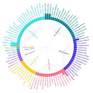
Lab 6
I used the visualization we created in class. This allowed me to follow along so that the visualization turns out as well as possible. The data allowed us to see the authors and the amount of citations the author and co authors had. I choose to present the data in a network graph because it is easy to clusters of citations and easily grasp the data on a first glance.
https://app.flourish.studio/visualisation/11444083/edit