Alright everyone! Welcome back.
I hope you enjoyed your 48 hours of data visualizations, many of which involved maps and all of which communicated lots of uncertainty.
My plan for today is to talk briefly about making maps as a type of visualization in Tableau, maps that are models vs maps that are descriptive (which shaped some of the election visualizations that I assume you saw.)
I also want to talk about using maps (and other visualizations) as part of digital storytelling, looking outside of Tableau for a little bit.
That all said, that was a stressful start to the week. However you feel about the outcomes (such as they are), did anything strike you, particularly thinking about how data has been used and communicated? Questions on process? Did you find you watched differently this year since we have been talking about data and representations?
Maps in Tableau
As you saw in the reading on mapping, there is a lot of information that has a geospatial aspect, but maps are not always the best choice, depending on the point you want to make. Once you have decided that your data and your argument would be well served by a map, there are a number of different kinds of maps to choose from.
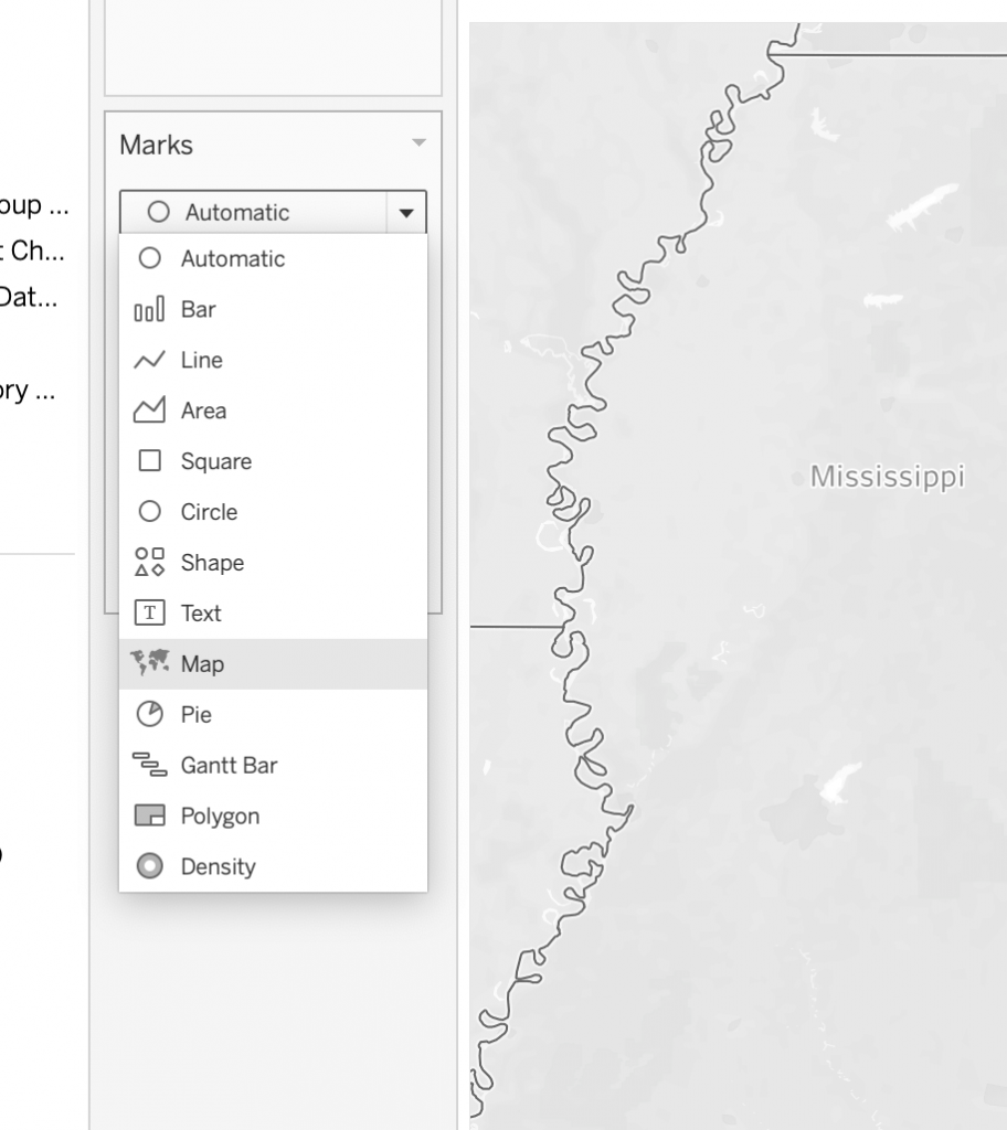
The two major kinds of maps are “symbol maps” and “fill maps.”
Symbol maps are what you are used to from plotting things on Google – a shape (a dot or a pin) for each data point, or a varying sized symbol (circle) for each geographic point.
Fill maps are what we have been seeing a lot of in election coverage and use “polygons” to outline an area, using color inside the polygon to indicate range or sums.
- side note: what is a polygon? (Geospatial analysis is built on polygons)
Within these two general categories of maps, there are a number different general kinds of maps. Tableau has resources (https://help.tableau.com/current/pro/desktop/en-us/maps_build.htm) on how to create these different kinds of maps – let’s look at them and we can go into more detail together if you are interested in one of them for your research.
I also want to point out a few fun options for maps in Tableau. This is going to be more sparse than the lab tutorials to date, for two reasons. First, we have been in Tableau for awhile and you have some ideas on how to work with your data. These are helpful hints and tips for working specifically with geographic data. And second, your projects are starting to diverge and you are developing ideas about your research questions, so with a little less structure in the lesson, we can focus on your data and questions.
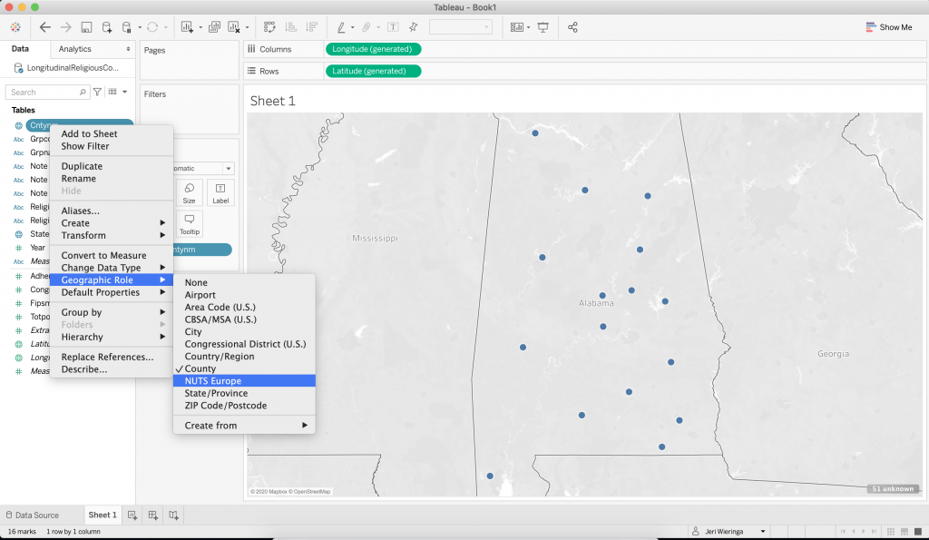
Assign geographic role to your data fields to activate automatic mapping capabilities
To trigger Tableau associating latitude and longitude data with your data, right click on the geographic dimension and assign it the appropriate geographic role. To see the results, drag the dimension onto the canvas.
Address unknown locations and changing between symbol and fill maps
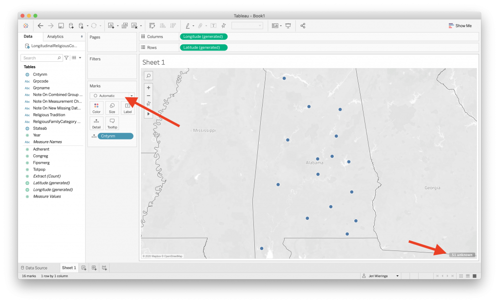
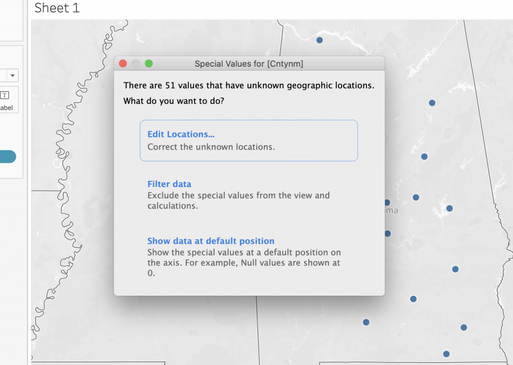
With the data on the canvas, you can see if there were any problems by looking for the little notice in the bottom right corner. Here we have 51 unknown locations to look into. If you click on the notice, it will launch a menu where you can determine how you want to address the errors. Start with “Edit Locations …”
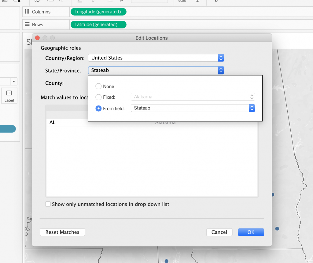
Here we can see that the county names could not be mapped because they were not unique enough. We need to give Tableau the state data to narrow down the options. Using the “From field” option we keep things linked to the data.
Additionally, Tableau will default to a symbol map, here with one ring for each county name. Use the “marks” menu to switch from a symbol map to a fill map; or add a dimension to the “Color” mark to automatically switch.
Map layers to customize the map and what information appears on it
To customize your map, go to the top menu and select “Map Layers” (note: there are a number of other customization options in here. You don’t need to know them for this class, but if you keep working with Tableau, they are worth looking at.). Map layers opens a side menu where you can control what appears on the map, as well as customize the appearance.
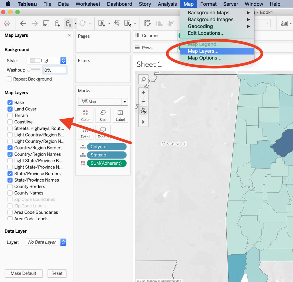
Additionally, Tableau comes with a number of built in data layers. This should raise some questions for you. The data comes from the American Community Census (from the US government). (For what year, you might ask. A good question, that.)

Things to think about:
- Built in location information and data is great, but be careful if using historical data – places move; county lines are redrawn. You may need to provide your own latitude and longitude data.
- Projections – Tableau uses Web Mercator by default, but you can and should upload other options for your work.
[youtube https://www.youtube.com/watch?v=OH1bZ0F3zVU]
Other kinds of maps in DH
For those of you who are feeling a bit overwhelmed by the data side of things, I wanted to offer a bit of relief. There are many projects in DH that use maps but as part of a storytelling strategy. There is still data (it is still just as complicated!), but there is less computation.
There are a few tools for this, but I want to point you at StoryMapJS, by the Knight Lab – https://storymap.knightlab.com/. This is a bit like building a Google Slide presentation, but with maps. You can add in images, media files, text blocks; your maps can be of real places, or not (such as this map of Arya’s travels (https://storymap.knightlab.com/examples/aryas-journey/).
These types of maps are not statistically descriptive and the model they offer is not computational. Rather this is a way to add maps and multimedia elements into the types of narrative model building we typically do in the humanities.
Resources:
- Adding different base maps: https://guides.library.ucsc.edu/DS/Resources/StoryMapsBasemap
Homework
Experiment with mapping, using either the longitudinal data set or your own secondary data. You can work in either Tableau or StoryMapJS. You should create at least two different Tableau maps or a StoryMap with at least 5 slides.
Embed or include a link to your work in a blog post. Include some commentary on why you think the question or data you are exploring is a spatial one and what you learned through the process.